the question
How can we enhance the social well being of the COVID-19 positive community?
My Role: Team Leader
Project Type: Academic, Website Design
Tools: Sketch, Figma
Responsibilites: Wireframing, Interface Design, Interactive Prototyping, User Research, Competitive Analysis
Maintaining healthy relationships is an essential human need. In fact, social wellness is correlated with an increased ability to respond to stress and a tendency to live longer. The COVID-19 positive community is physically isolated from the rest of society, deprived of the opportunity to form human connections, a fundamental human desire. Unsurprisingly, COVID-19 positive patients are more likely than others to develop mental health issues such as anxiety and depression.
In this project, it was my team's goal to design a web application aimed at enhancing the social well-being of the COVID-19 positive community in order to improve their quality of life and enrich their quarantine experience. We hope to offer the community a platform to share their experiences, reach out to others, seek advice, and maintain maximal social interactions just as they would have been able to do in a pre-Covid era.
User Research
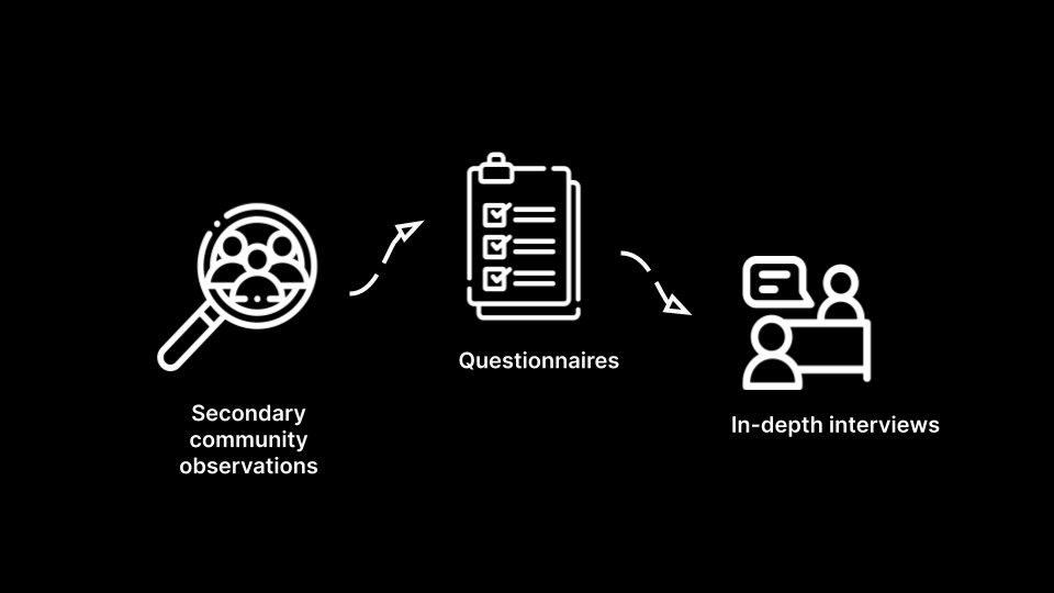
In order to gain a better understanding of the shared behavioral tendencies and sentiments relating to social interaction within the COVID-19 positive community, our team conducted thorough user research using a variety of methods.
Key Findings
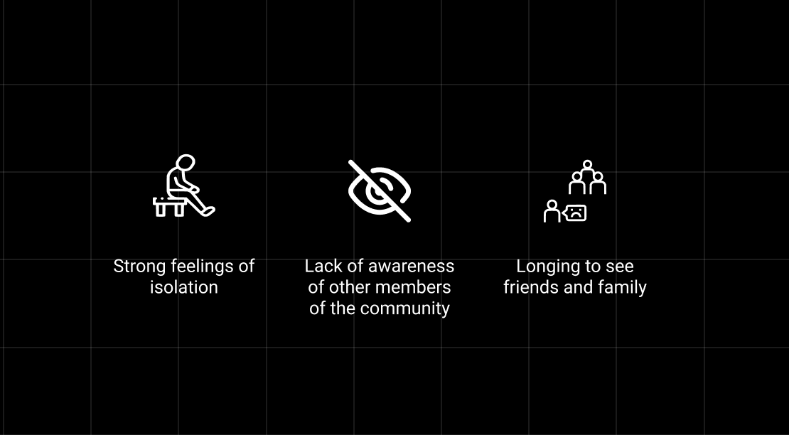
Over 69% of our survey responders expressed significant feelings of isolation from others. Additonally, over 67% also expressed a longing to see their friends and family. Eating out with friends was the highest ranked social activity that members missed the most.
Based on responses from our interviewees, we discovered that COVID positive individuals also seemed to lack a strong sense of support from within their community:

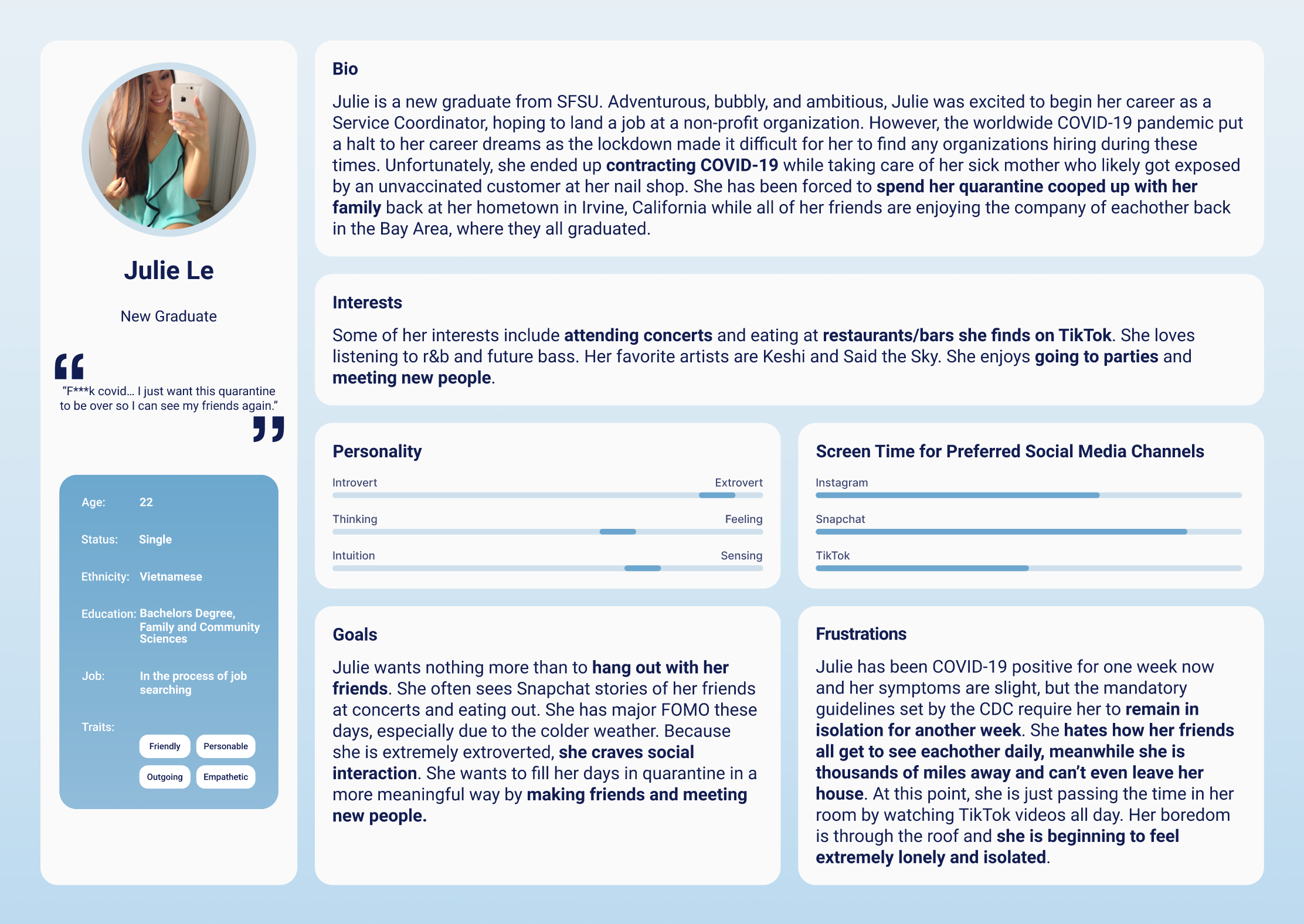
Using these insights, we created our primary persona which represented a 22 year old, recent university graduate named Julie, a demographic representative of the majority of our responders from our initial questionnaire.
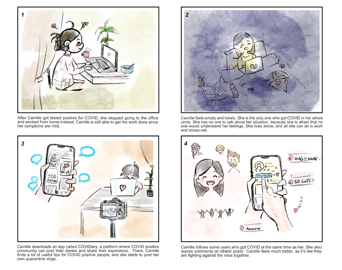
With our primary persona in mind, we split up to create storyboards in order to convey our user's journey.
"COVIDiary"
"The Interactive Eating Experience"
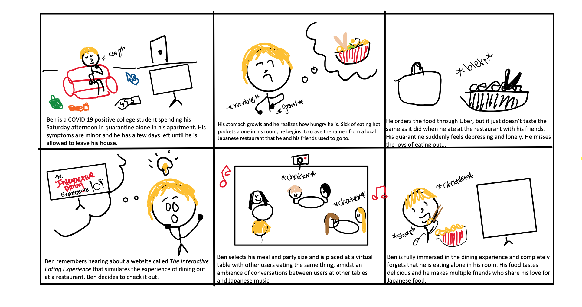
After a second round of interviews where we pitched our storyboards to community members, feedback on these two scenarios in particular were overwhelmingly positive due to their creativity and projected value. One interviewee especially loved the idea of offering COVID-19 patients the opportunity to eat with strangers with a shared interest in food, as it is unique and addresses a very common desire of patients who are quarantined. COVIDiary was also a strong contender because of its utility in facilitating a sense of community among COVID positive patients, which was a primary pain point from our personas.
The Proposed Solution
Design Principles
Key Solution Elements
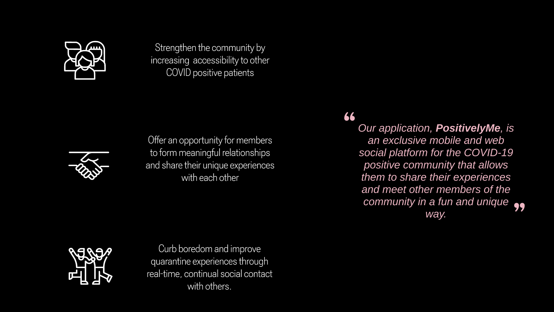
Stengthening the community
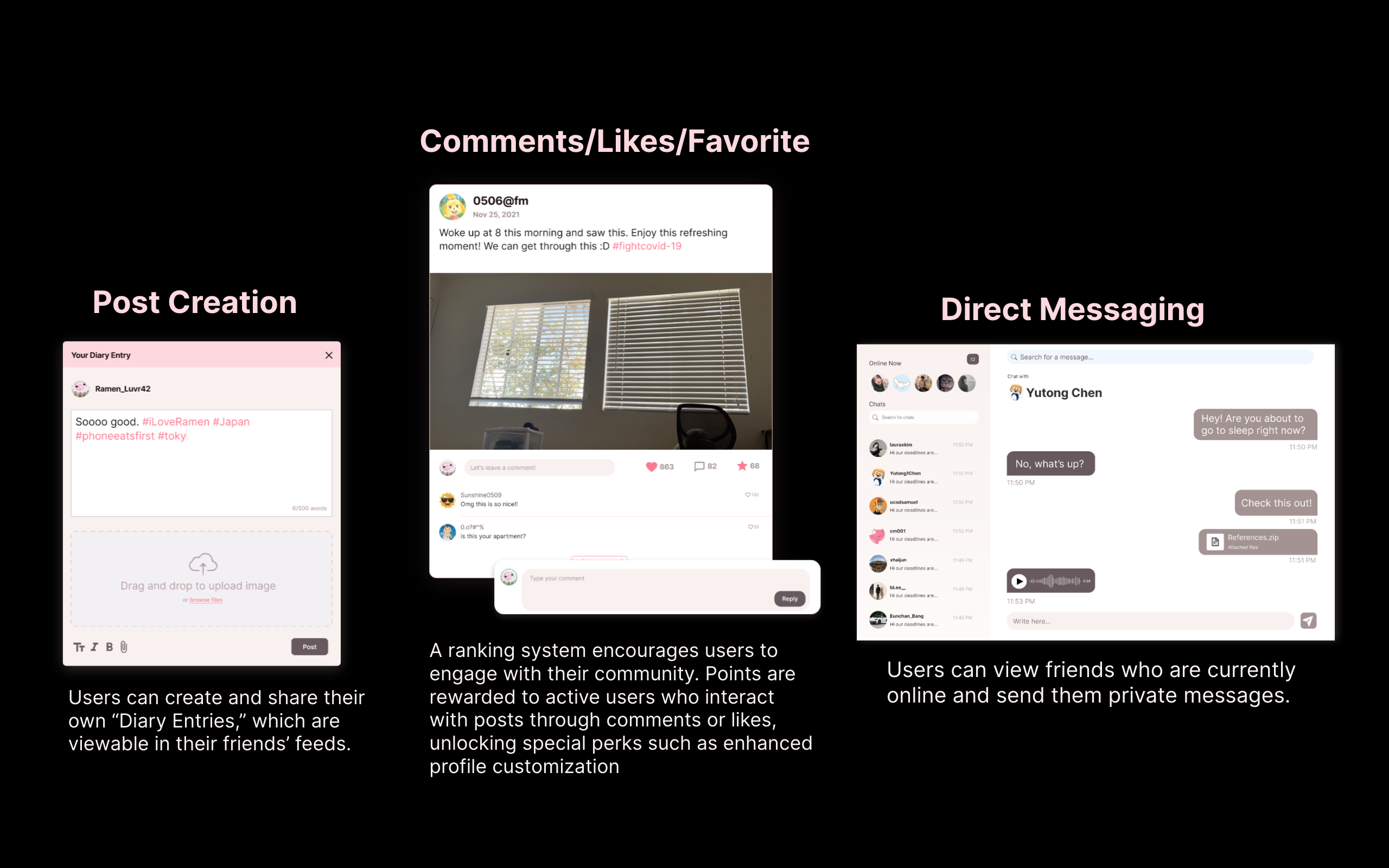
Users are provided with the ability to post their experiences in the form of "diary entries", interact with other users' content, and privately message friends.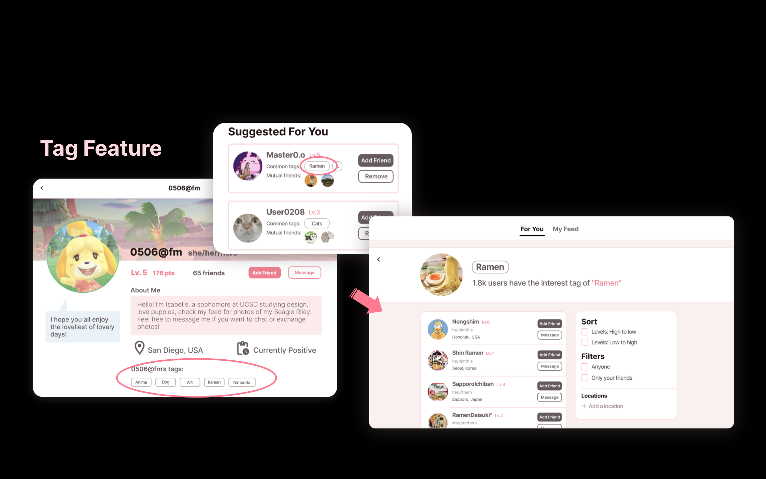
Facilitating the formation of meaningful relationships
Our application encourages the development of meaningful relationships between our users through a tag feature on a user’s public profile page that displays the user’s top interest(s). Users can utilize these tags to find other users who share similar interests with them and start a conversation.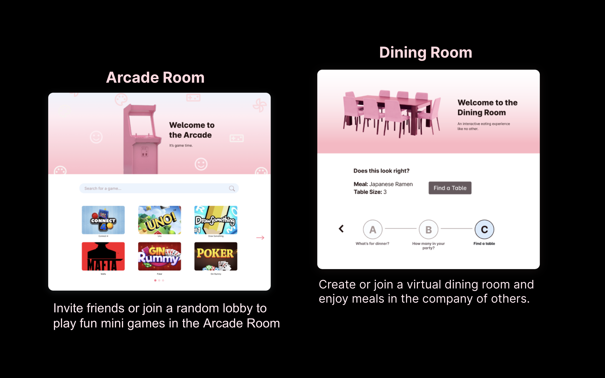
Enhancing the quarantine experience
The virtual Dining and Arcade Rooms are the unique features that set our application apart from other social media platforms and offer alternative outlets to relieve boredom.
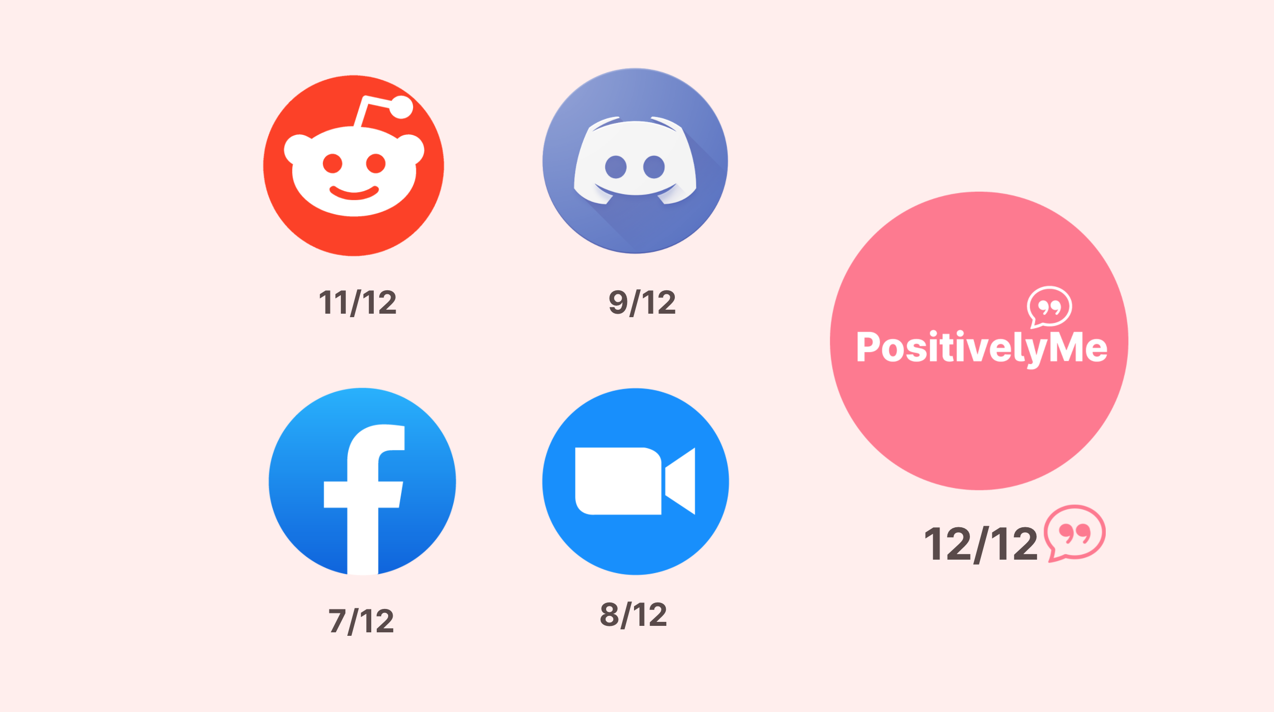
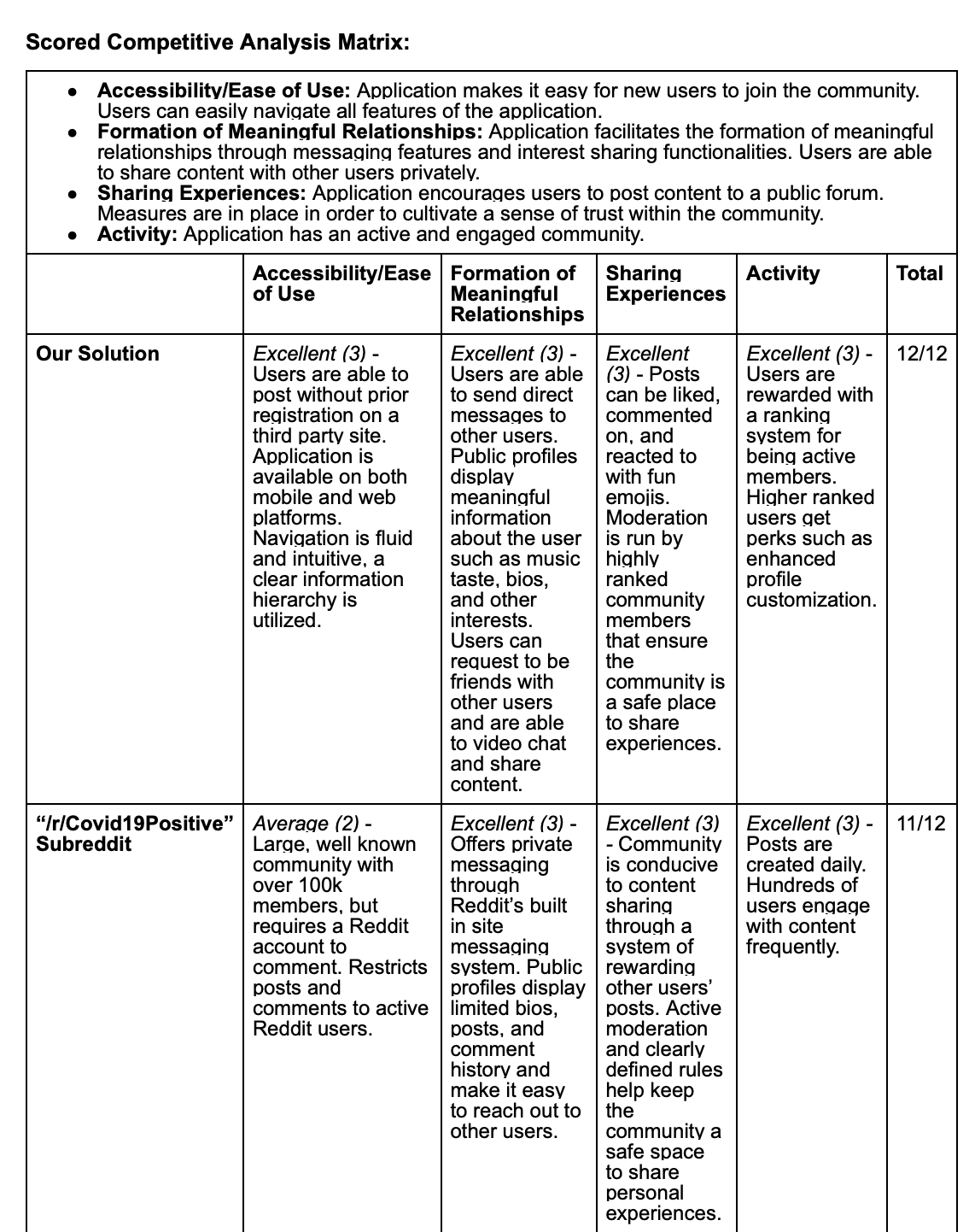
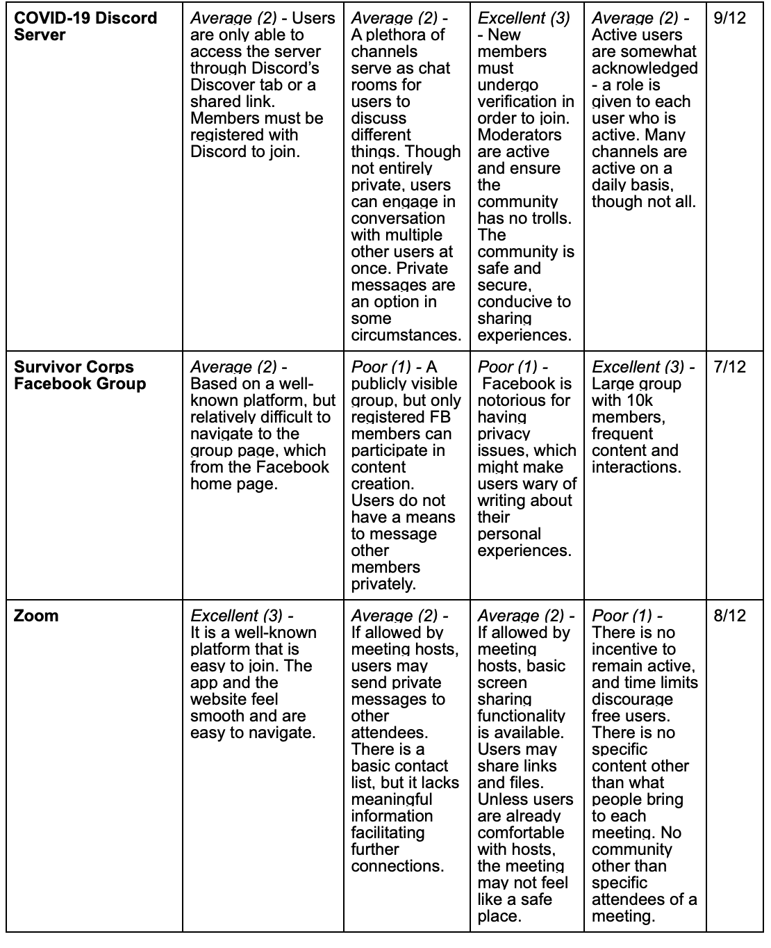
Our Competitive Advantage
Our Competitive Advantage
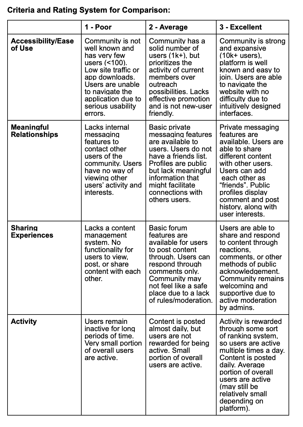
We developed a set of specific, consistent and accessible criteria for comparison and analyzed a variety of different COVID-19 positive community platforms such as the COVID-19 Discord Server and the Survivor Corps Facebook Group.
Results:
Information Architecture
Moving forward with the prototyping process, we listed the key functions/tasks that our interactive system needed to support, such as a public feed, a friends list, a direct messaging feature, public profiles, and post creation. We then divided the work and sketched out wireframes for the main pages of the user interface.
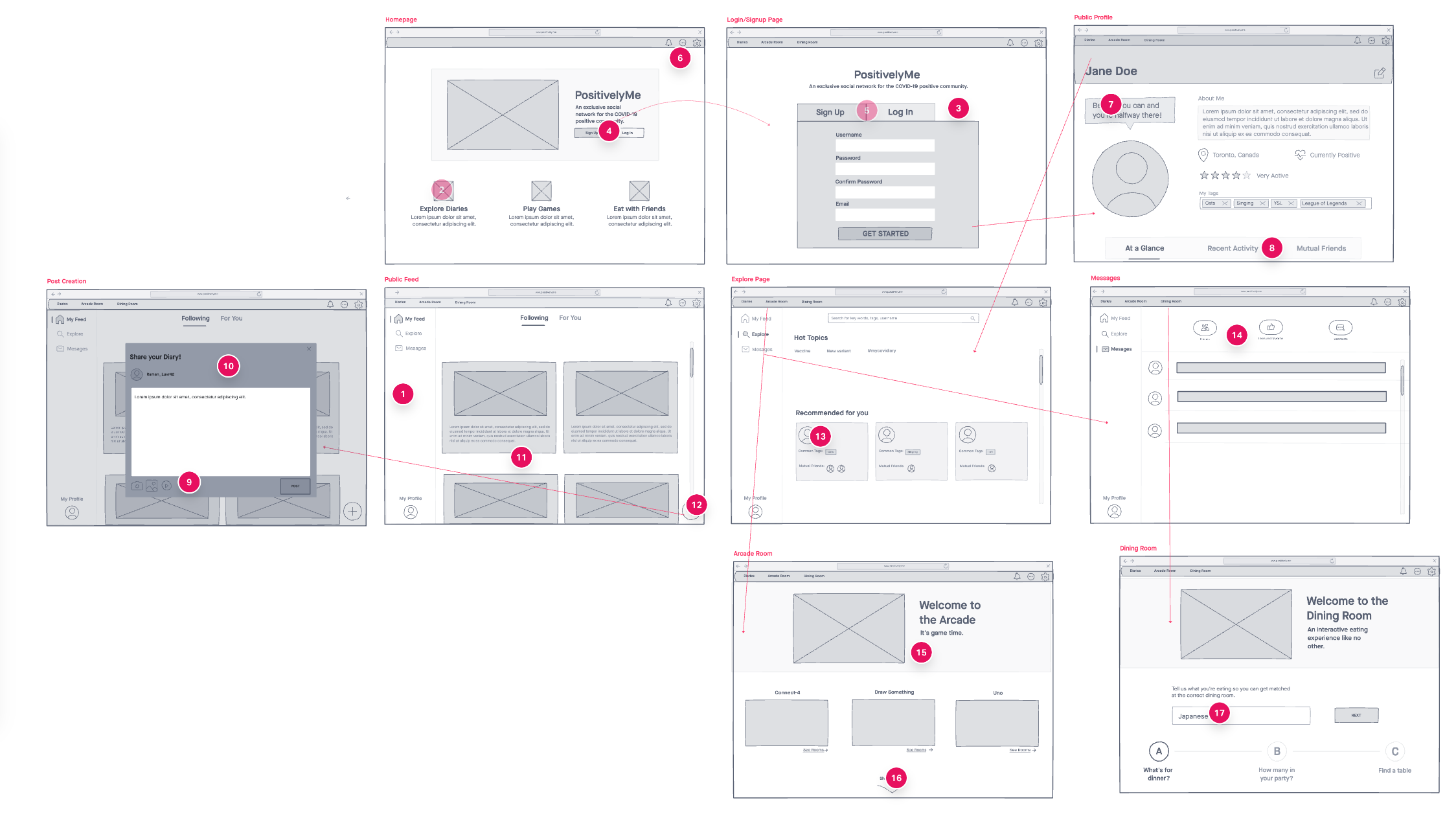
Wireframes
designed collaboratively through Sketch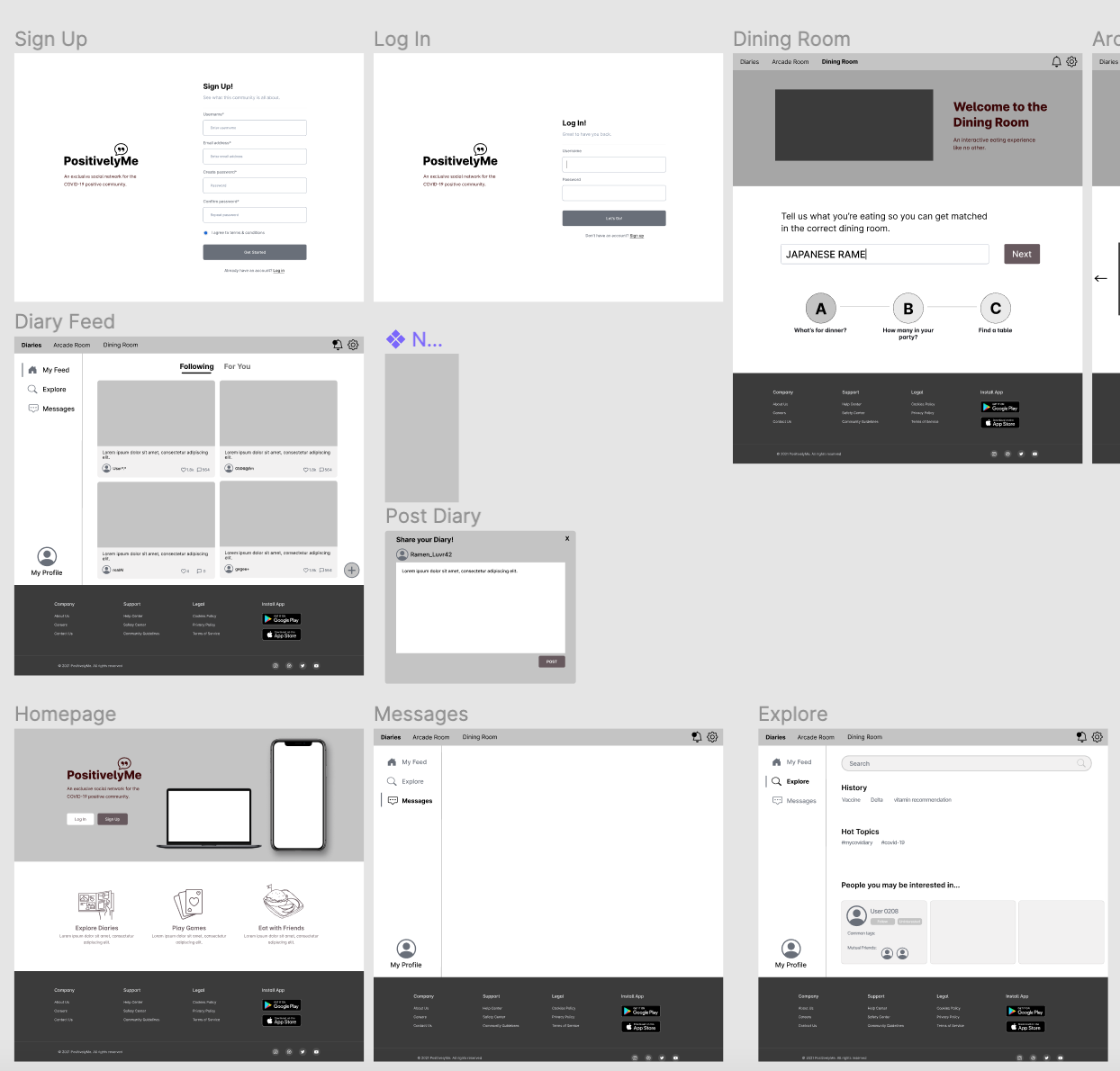
The iterative design process
As we continued to build on our sketches and wireframes, we moved to Figma to begin developing our low-fidelity prototype, which would allow us to test out the key functions of our application and demonstrate a rough version of the user experience. We tested our prototypes with other teams through Zoom after drafting a Usability Plan that outlined a list of tasks for our users to complete and a list of interview questions to capture their thoughts on their experience with the prototype.
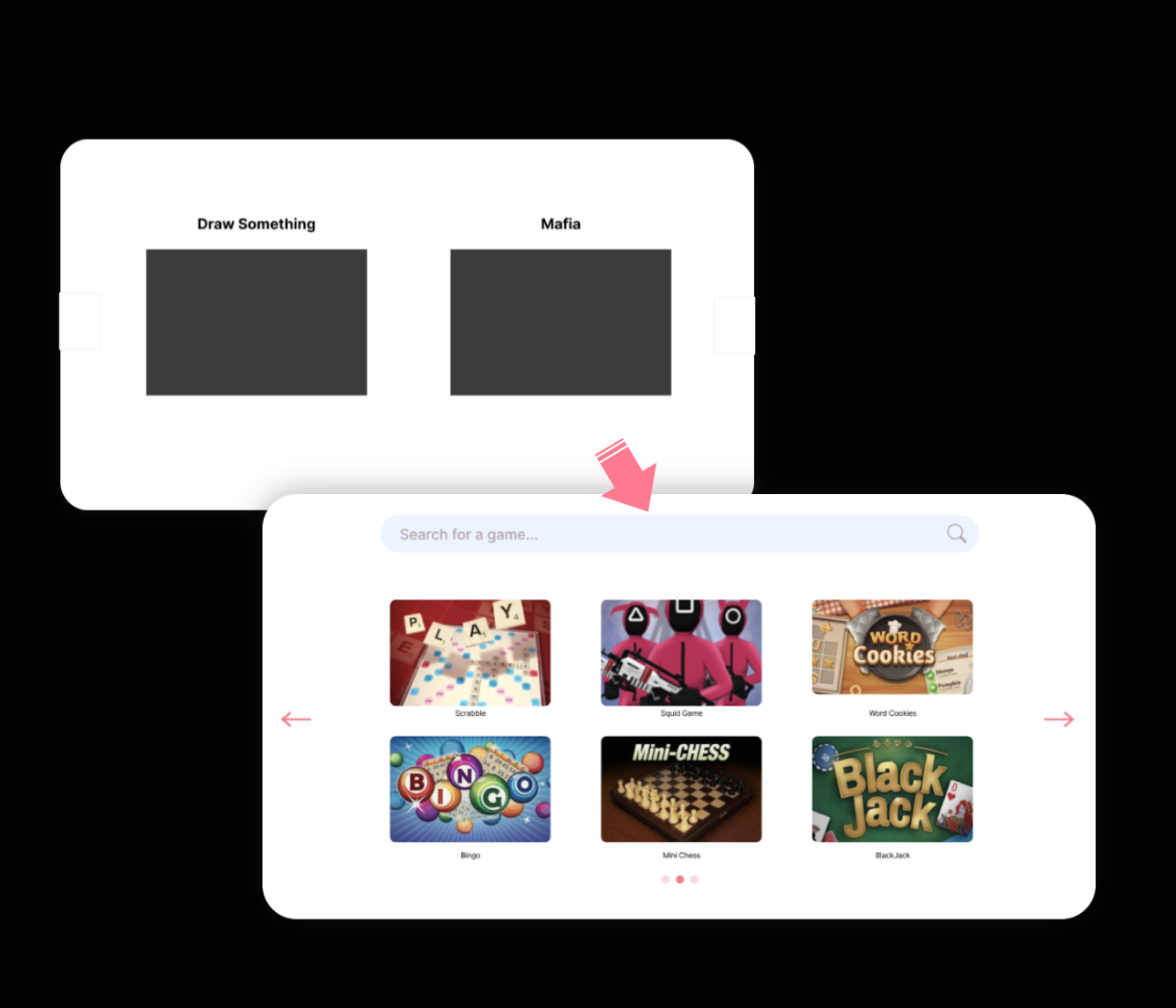
For example, the horizontal scrolling that we implemented in the game gallery of our Arcade Room was a particular point of interest in our user tests, with many of our participants noting that it was not obvious that the option to scroll was available. We incorporated this feedback by removing the horizontal scroll functionality and instead replaced it with two arrows and an indicator at the bottom to demonstrate that there were more pages available for viewing.
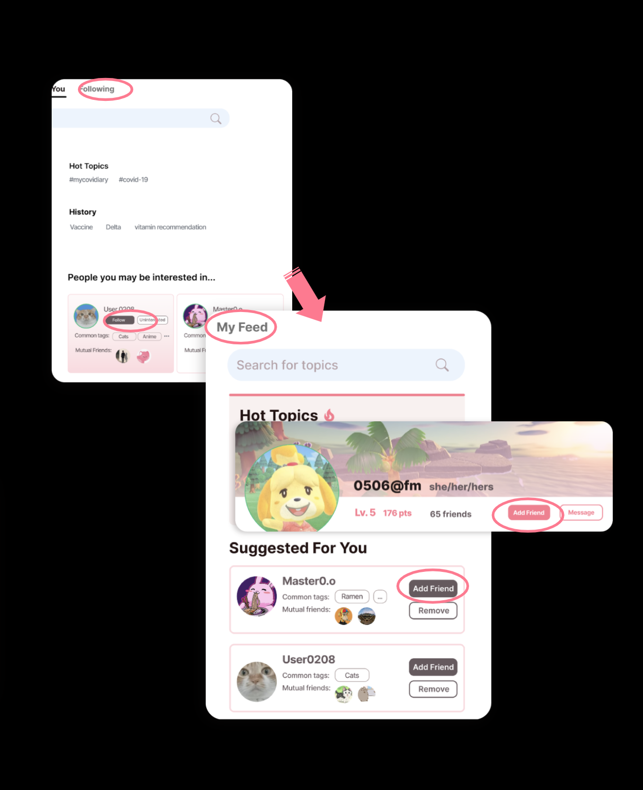
Additionally, we received feedback that the ability to “follow” a user and the ability to add a user as a friend seem a bit redundant, and that there was no clear distinction between those two functionalities. As a result, we ended up eliminating the “Following” feature. Overall, our users were satisfied with the flow of our application and its intuitive global design.
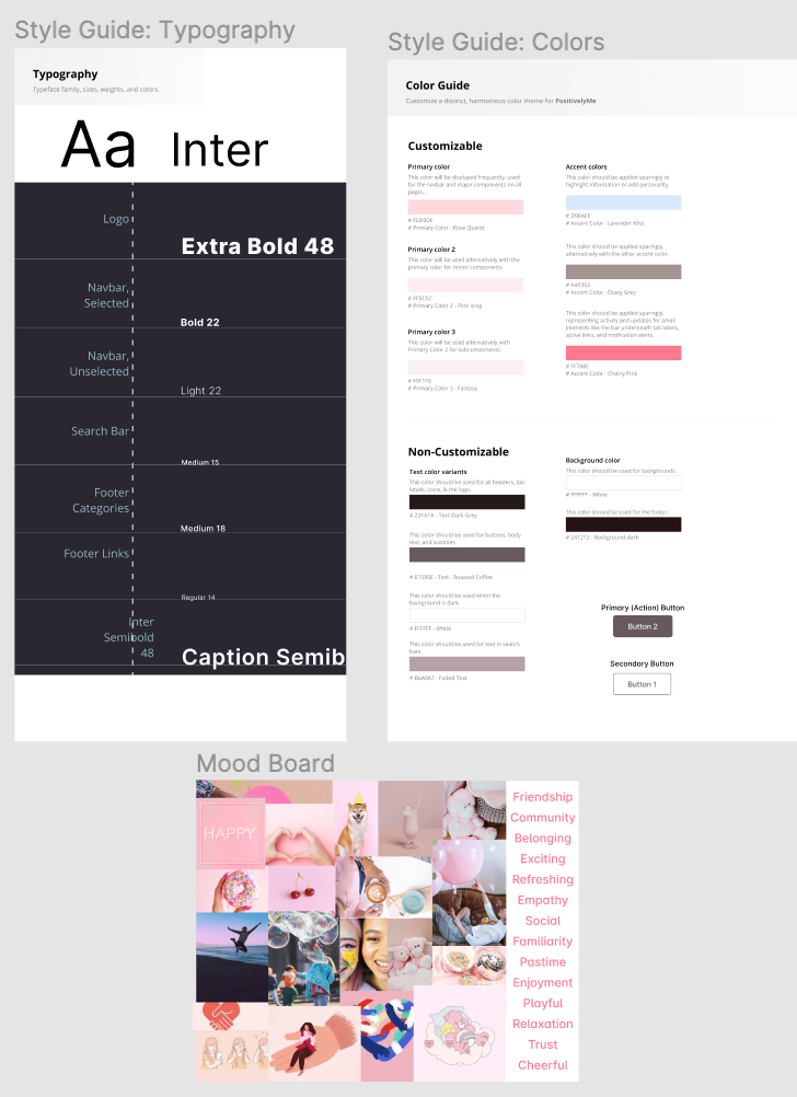
Visual Design
Drawing inspiration from our user research and personas, we drafted a list of words that we felt captured the essence of the emotional experience we wanted to evoke with our design. A few of our words were “friendship”, “familiarity”, “trust”, “playful”, and “cheery”. Using our list of words, we created a moodboard by compiling images that exhibited a consistent mood and color composition. We then used this moodboard to select colors, typefaces, and design elements for our style guide, which outlined specifications for primary and secondary color palettes, standards for font and typefaces, and other design elements like a logo and navbar. We used various shades of pink for a bright and playful feel and cool blues to visually balance the palette and capture a “refreshing” feel.
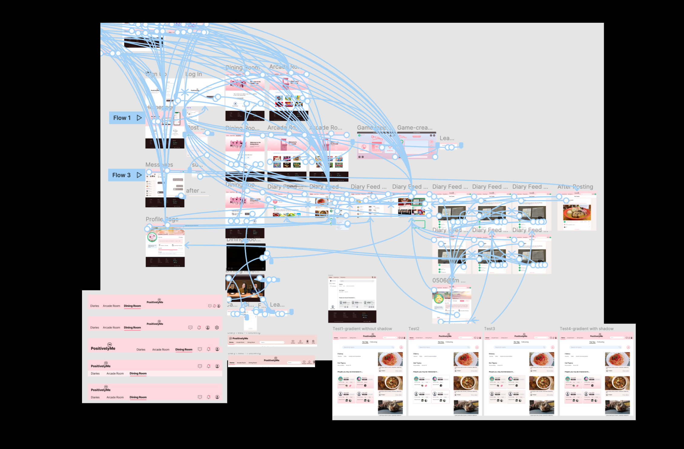
Interactive Prototyping
Using our team’s design language specified in our style guide, we began to fill
our click-through demo with high fidelity screens and images. We
created flows for creating a diary post, navigating the diary feed, joining
a Dining Room, locating and messaging a friend, and more.
We drafted a
second usability test plan that guided users through each flow, and
continued to test, iterate, and refine with other teams and instructional
assistants. Some of our feedback included a few functionality suggestions.
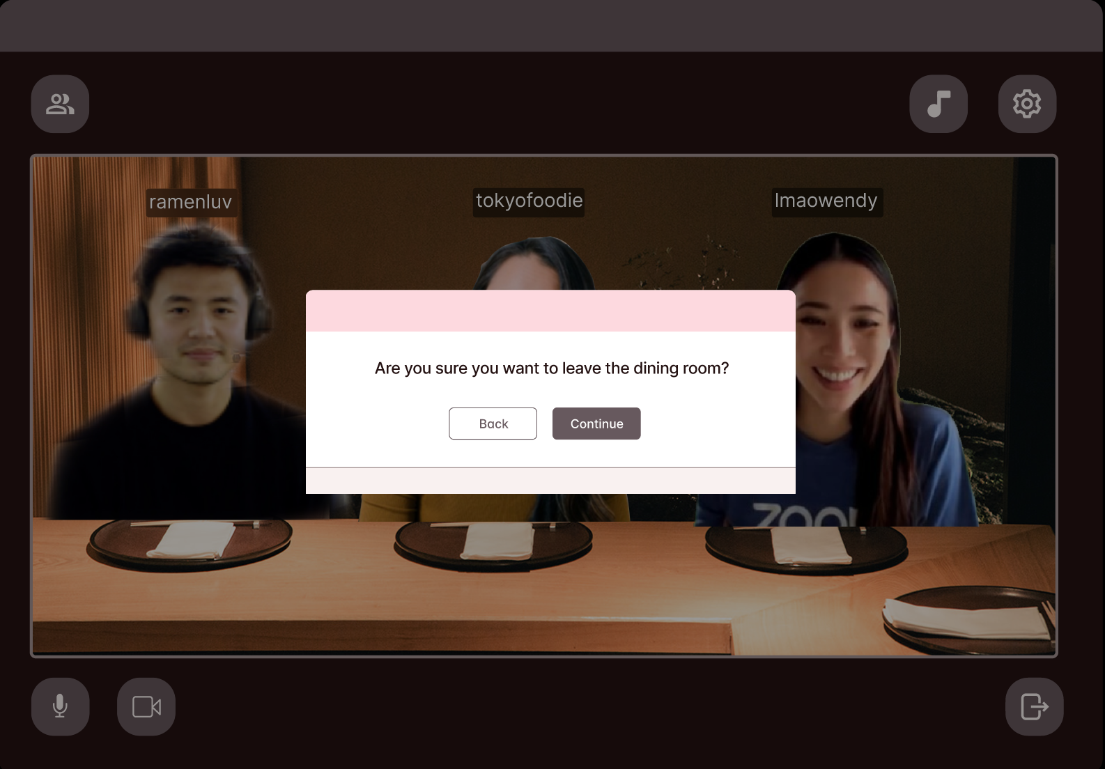
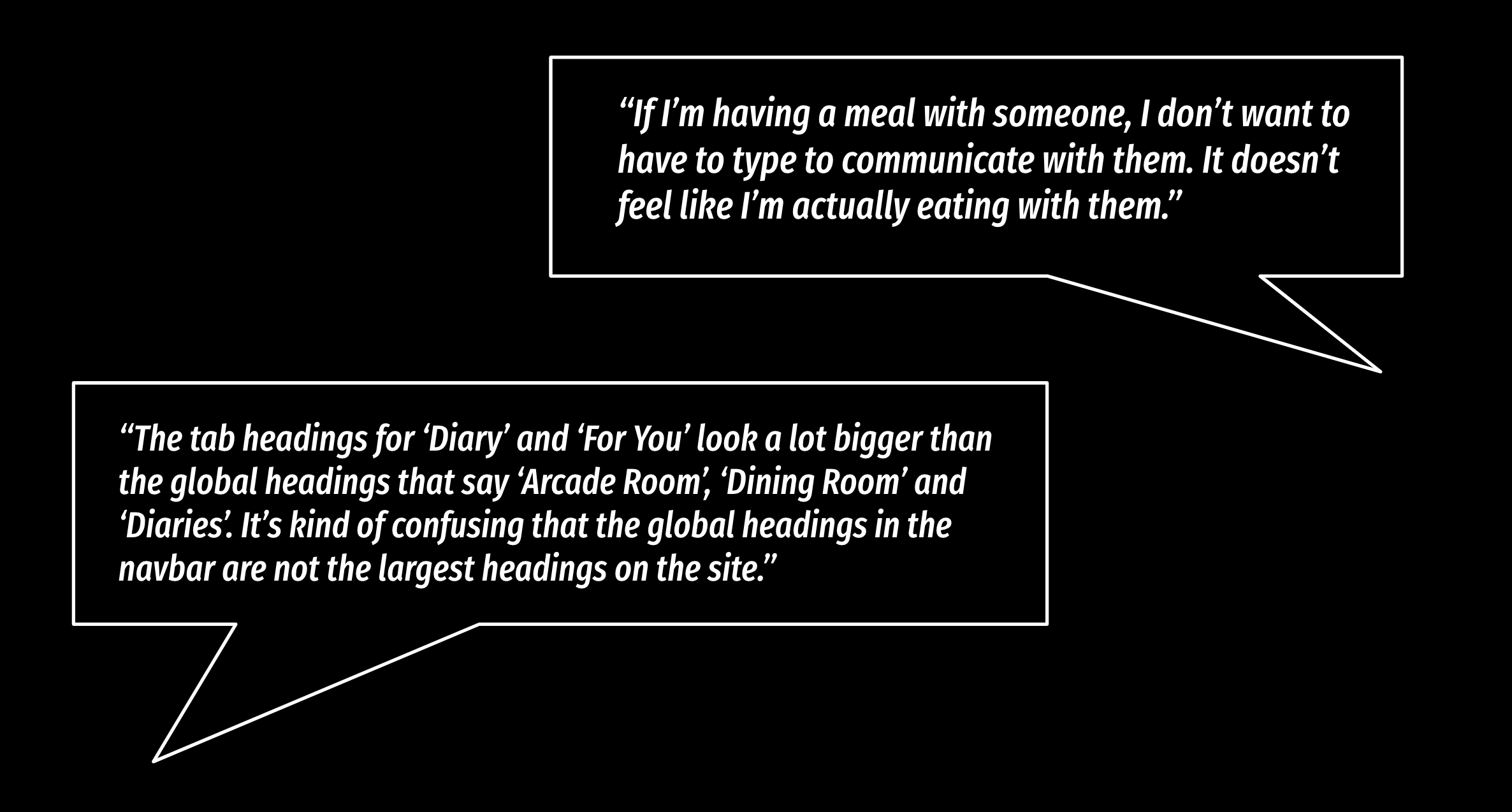
When asked about the possibility of a chat feature in the Dining Room, one
of our participants expressed that it might not be a good idea because it
would be adding extra functionalities that don’t really fit into the theme
of a Dining Room. After discussing with the team whether a messaging feature
would be beneficial to the Dining Room, we opted to remove the feature
because it was disruptive to the establishment of a realistic simulation of
a dining experience with friends.
Furthermore, we received feedback that
our global tab headings in the navbar were far too small in comparison with
the labels on the other pages, making it difficult to identify what the
main pages of the site were. In order to establish a more intuitive visual
hierarchy in our text, we ended up making the font on the global tabs larger
so that they were not overpowered by body text within the tabs.
Watch a live demo of our prototype:
Hi-Fi Screens
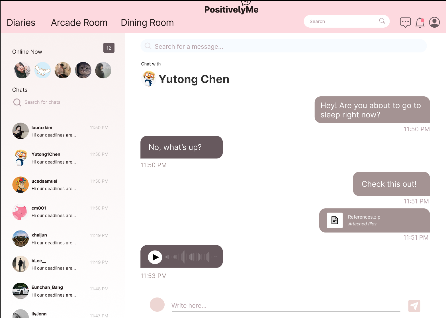
Messaging Feature
Users have the ability to send private messages to their friends
Dining Room
Users can join a virtual dining room and enjoy their meals in the company of others..
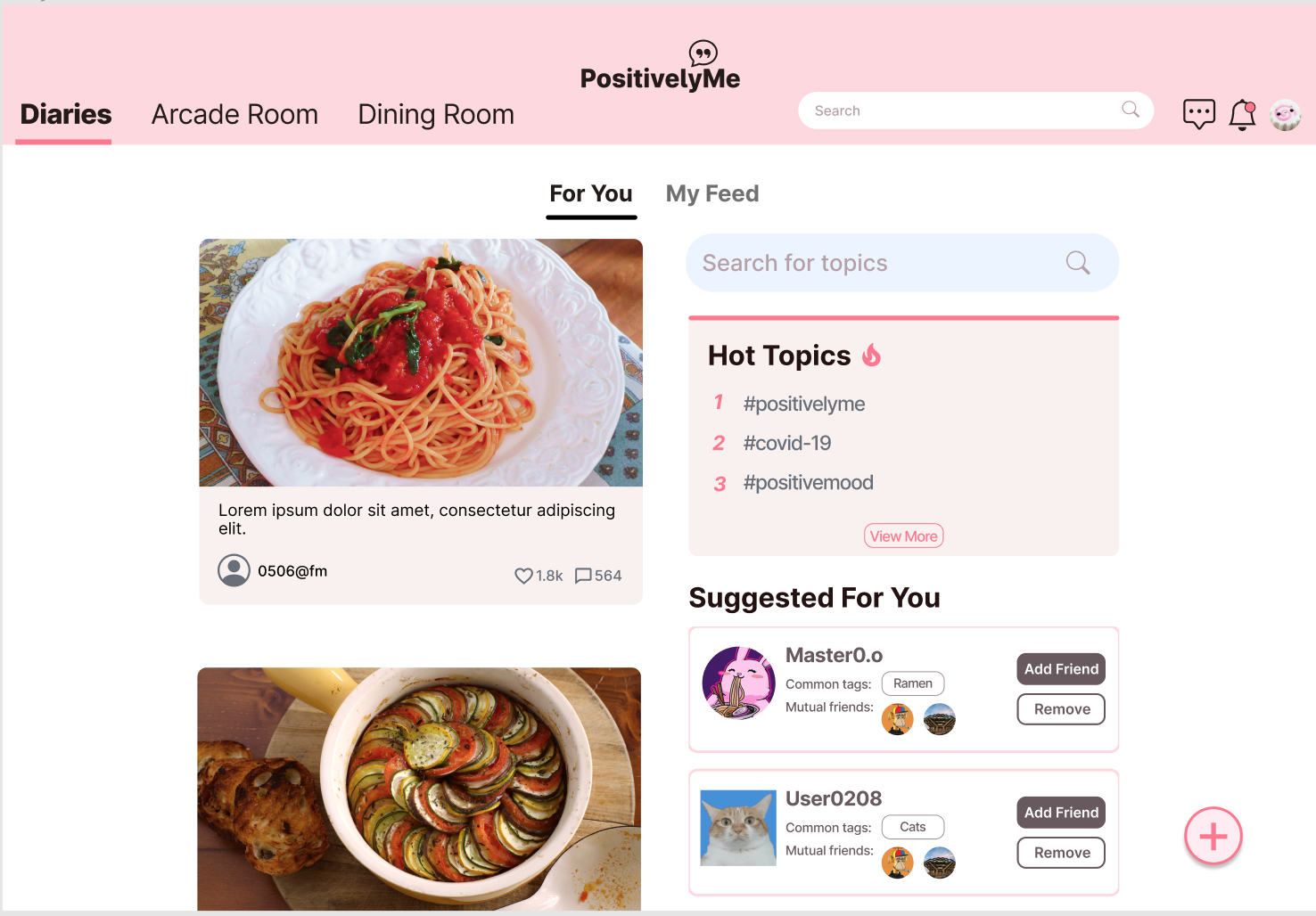
Explore Page
Suggested posts and friends are displayed in a "For You" page within the diary feed.
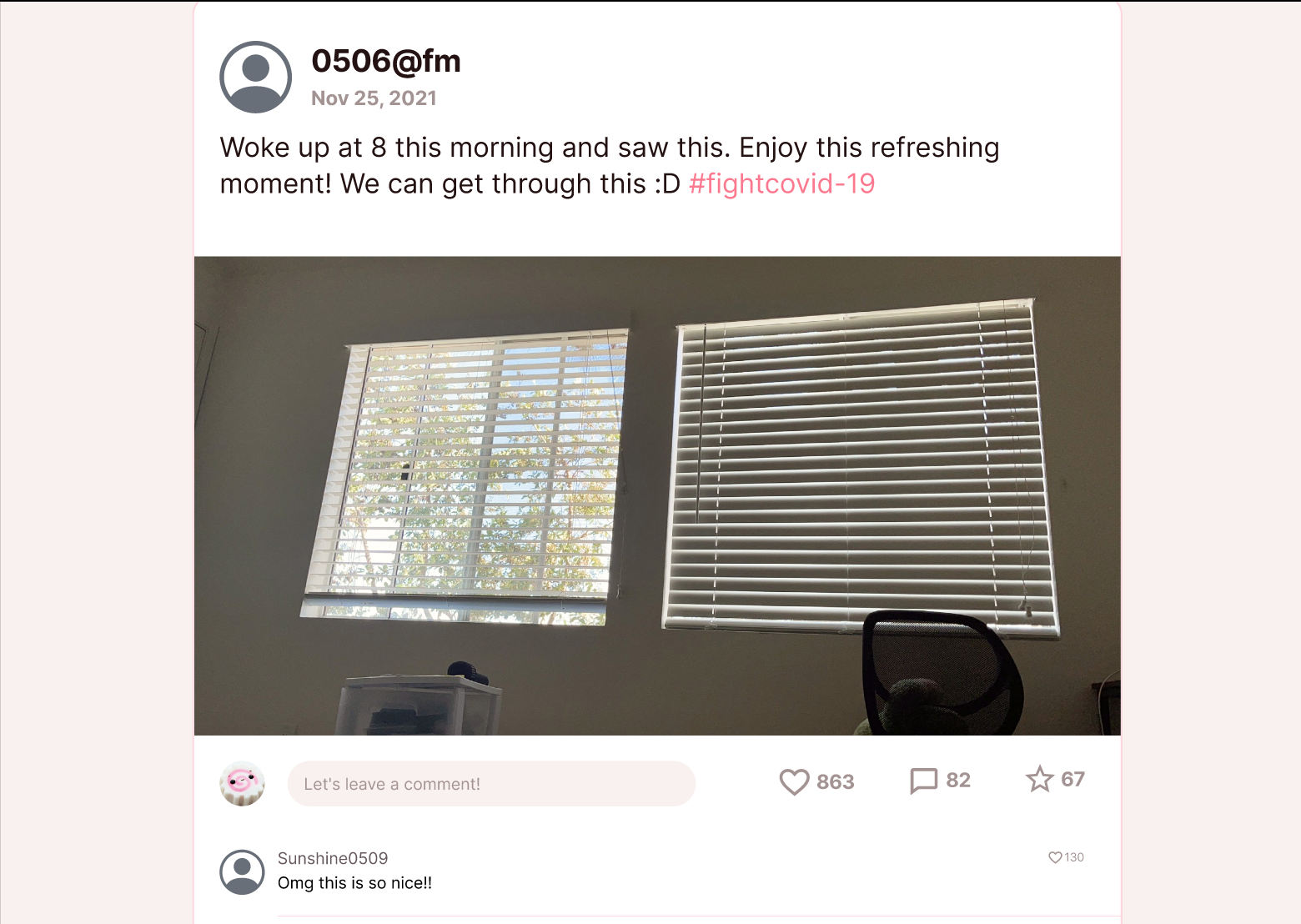
View Post
Users can view and react to posts in their feed by commenting, liking, and favoriting.
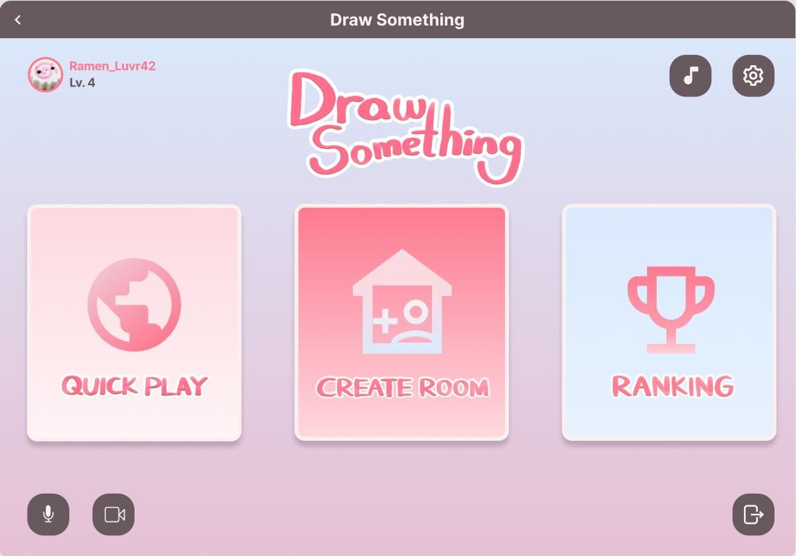
Play Game
Users can invite friends to arcade rooms to play games like Draw Something.
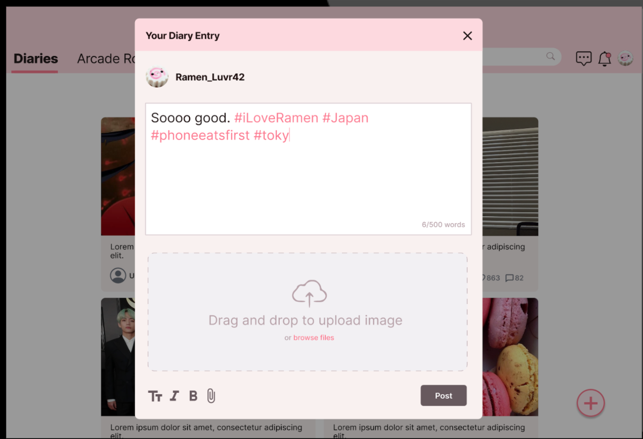
Create Post
Users can create and share diary entries..
Final Thoughts
After multiple rounds of iterations, we were left with a polished, interactive prototype of our application. Through this experience, I learned a great deal about the value of adhering to a human-centered design process in order to develop products that will deeply resonate with a specific audience. It is so important to continually immerse yourself in the experiences of your target audience throughout the entire design process as you create storyboards and personas, conduct user testing, and sketch out your wireframes. Reflecting on this project, there are a few things I wish I would have done differently. Given the time constraints of this project, we were only given about a week and a half to test, iterate, and refine our protoype. If time had allowed, I definitely would have wanted to conduct A/B testing, especially on our Diaries page. Our team struggled a lot when designing its layout, specifically the location of the "Plus" button to add a post. Unfortunately, limited resources and time did not permit us to properly test our designs. As a result, many of our design decisions were not driven by data, but by standard layout conventions taken from other social media websites, which can be biased towards different audiences and different goals.