the challenge
How can we make travelling a more stress-free experience?
My Role: Team Leader
Project Type: Mobile App Design (Academic)
Tools: Figma
Responsibilites: User Personas, Storyboarding, Interactive Prototyping, Competitive Analysis
Whether it's visiting loved ones, escaping from work, or exploring a new city, travelling should be a time of relaxation and excitement. Unfortunately, the stress of travel planning, unfamiliarity with a destination, and financial strain can make a giant headache out of what should be an enjoyable experience.
In this project, it was my team's goal to lift the burden off of the weary traveller by designing a mobile application that manages all the pre-trip logistical details in one place.
The Team
In the first week, we formed our teams and focused on
developing group rapport. We had “speed dates” in randomized groups where we shared our specialties
and previous design and programming experience with eachother. The aim was to form a team in which
all roles in Jesse Garrett’s “9 Pillars of Successful Web Teams” were fulfilled.
My role in my team was the Project Manager/User Researcher. I was in charge of all the logistical details -
I coordinated meetings with our mentor, kept track of deadlines, drafted all the deliverables,
delegated tasks, prepared meeting agendas, and initiated weekly check-ins. Additionally, I
prepared a Usability Testing Plan for our beta prototype. Our first task as a group was to come
up with a team name and logo that represented a group identity. We chose the name "In-n-Out Gaming"
as we were all fans of the famous west coast burger joint as well as avid video game enthusiasts.
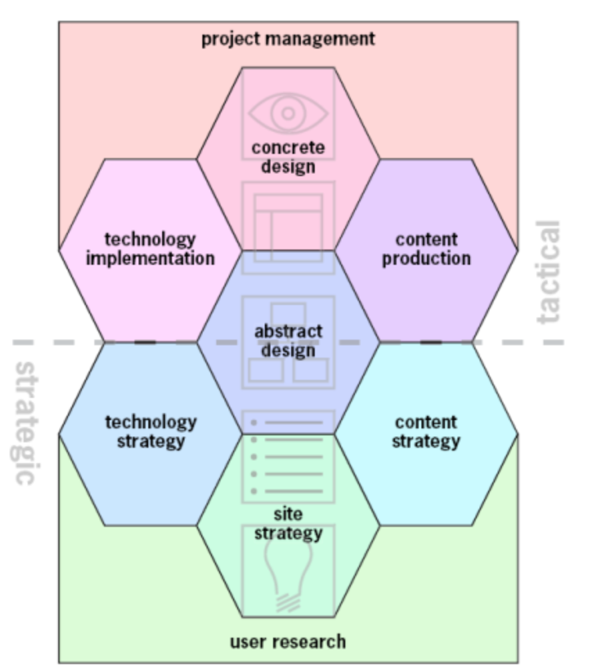
9 Pillars of a Successful Web Team
My primary role was the Project Manager.
Ideation
We pitched our initial ideas to eachother by brainwriting - each team member was given a day to write down 2 app ideas in a shared document, no more than one sentence each. This was the most ideal approach given our time constraints and encouraged creativity without judgment by enforcing anonymity.
The next day, we convened again to read the list of app ideas. I facilitated this discussion, inviting my members to share their favorite ideas and bringing up possible difficulties. One proposed solution was "an application that collects the latest information about flight details such as take off/landing times, cost, availability, etc, while also finding the best deals on flights according to a user's need." After much deliberation, we concluded that while this solution may have useful features, its functionality is not new and is used often by Google Flights' search engine.
We eventually decided upon a very unique and creative solution that integrated two members' ideas together - a travel planning app that can virtually organize a suitcase using augmented reality to scan and measure items. Additionally, it would offer useful planning details such as packing suggestions based on user input of trip destination and length, as well as aggregrate important trip information such as local activities and weather. We also decided on the name PackBuddy. Light and fun, we felt the name demonstrated the sort of reassurance of a friend that we wanted to offer to prospective travellers through our application.
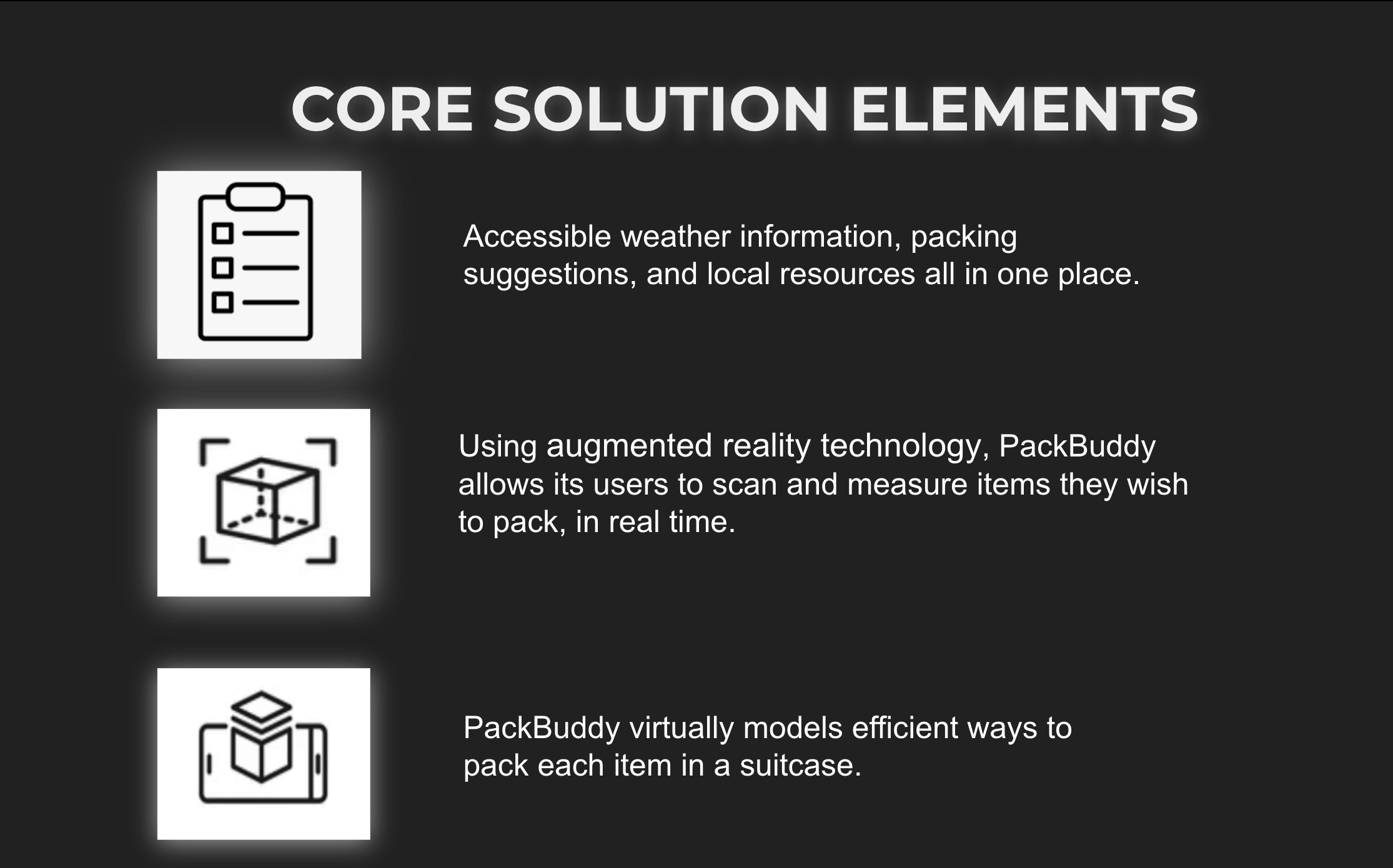
User Journey
In order to understand what our target user base for our application would be, we split up to create personas for individuals who we envisioned would benefit the most from our app.
Read more about the process in our team blog.
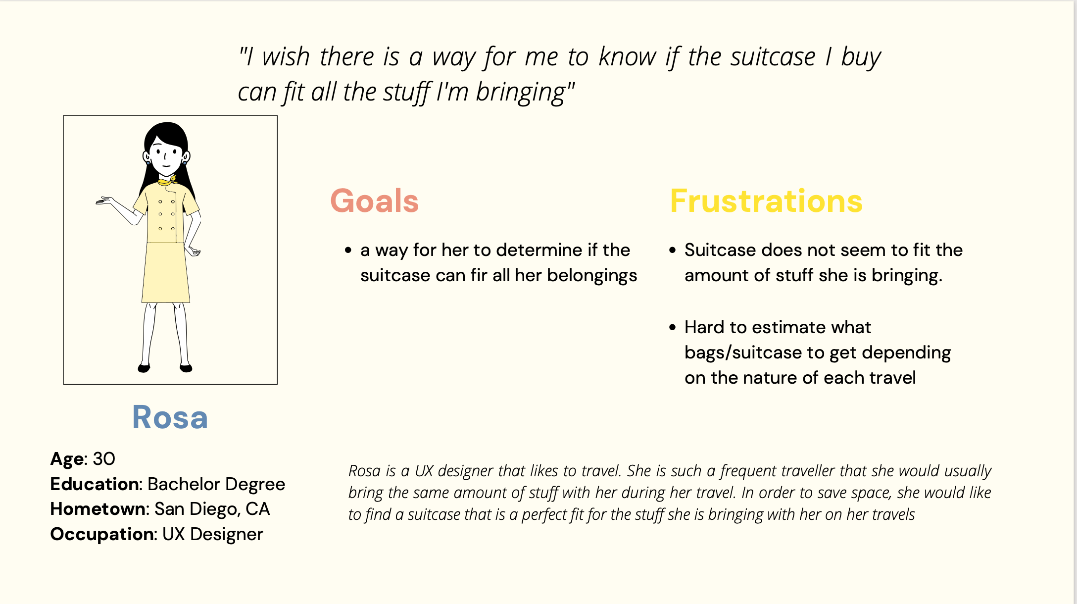
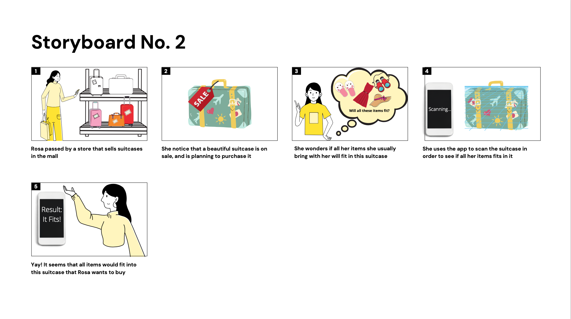
We imagined our personas in scenarios where our app would be useful to them, sketching each idea out in a storyboard format. Since each member needed to develop at least one storyboard, we ended up exploring a variety of unique uses for our proposed solution which we had not originally thought of. For example, we originally envisioned our suitcase packing feature used by travelers who were struggling to fit all their items into their suitcase. However, one of our graphic designers demonstrated this feature in an alternative scenario - a prospective traveler shopping for a suitcase uses our app to see if the items she was planning on bringing will fit into the suitcase before she buys it. The variety of perspectives we were able to obtain in this exercise was extremely useful to our design process as it helped us truly visualize the utility of our application and understand the many ways our users will interact with our product.
Another persona created by one of our graphic designers illustrates a stressed university student who is packing to study abroad.
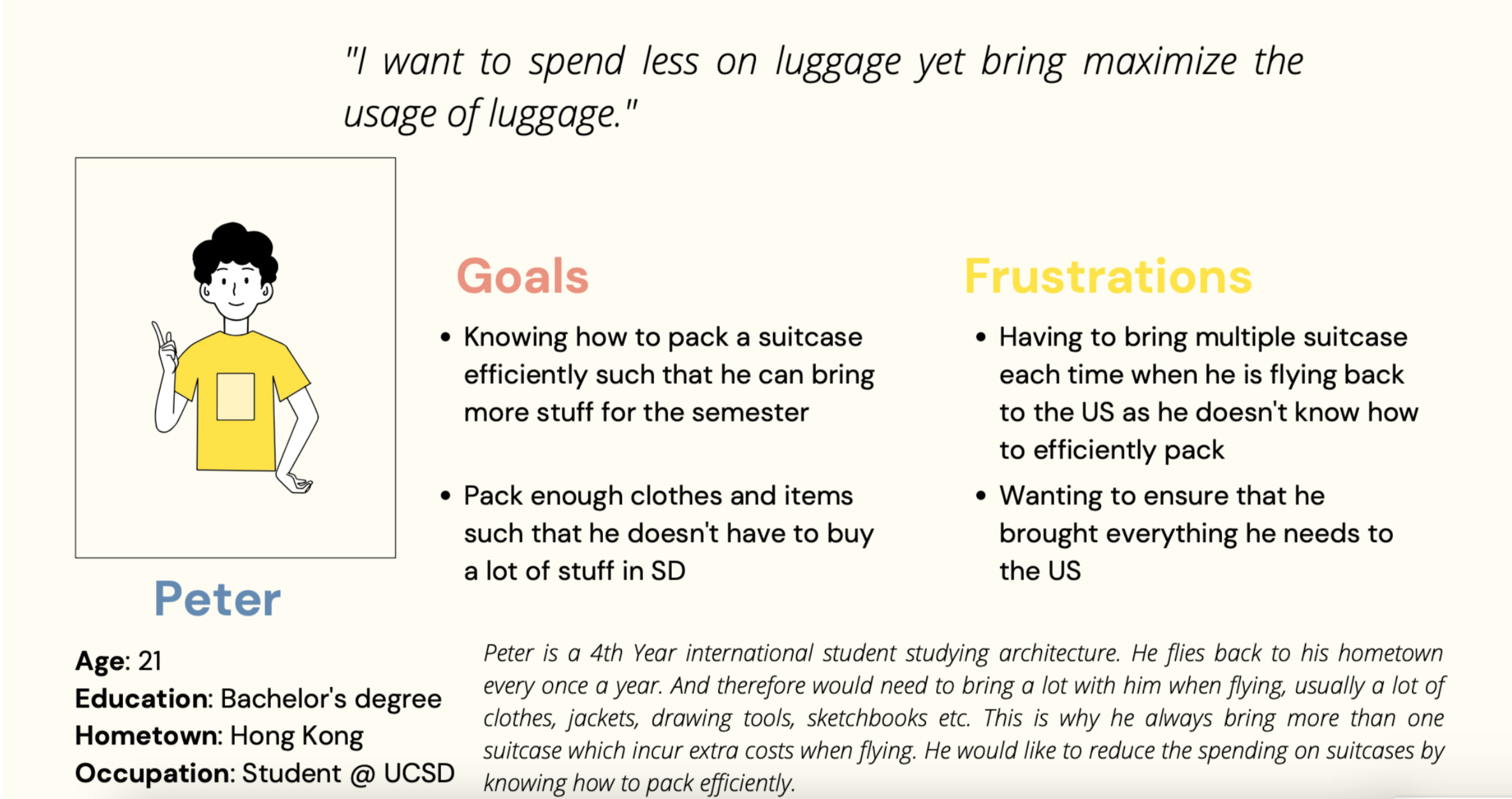
We also incorporated this persona into a storyboard, but this time in the format of a commercial. We made sure to describe what we anticipated to be our user's main pain points - anxiety in trip planning.
Competitive Analysis
I also led a few of our group members in drafting a Competiive Analysis. Our aim for this deliverable was to solidify the features and functionality of our product and analyze how they stand up against our competitors. We used two different packing list apps as reference: Packpoint and Packr. We defined each product and created a list of common features such as activity suggestions and weather forecast.
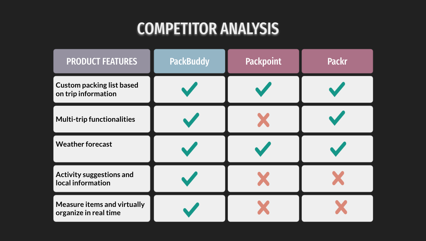
Why PackBuddy?
Our unique competitive advantage centered around our augmented reality capabilities that accurately analyze suitcase dimensions and generate a virtual model of effective packing solutions, as well as our expansive functionalities that allow for the creation of a custom packing list, tailored for each trip based on various trip information such as weather forecast and duration of stay.
Interactive Prototyping
With our key solution elements narrowed down and a strong idea of our intended user experience, we moved on to begin the prototyping stage. Our first step was to create a design system that would best represent how we wanted our user to feel when interacting with our app. We discussed color schemes and fonts and mapped out all the elements of our UI.
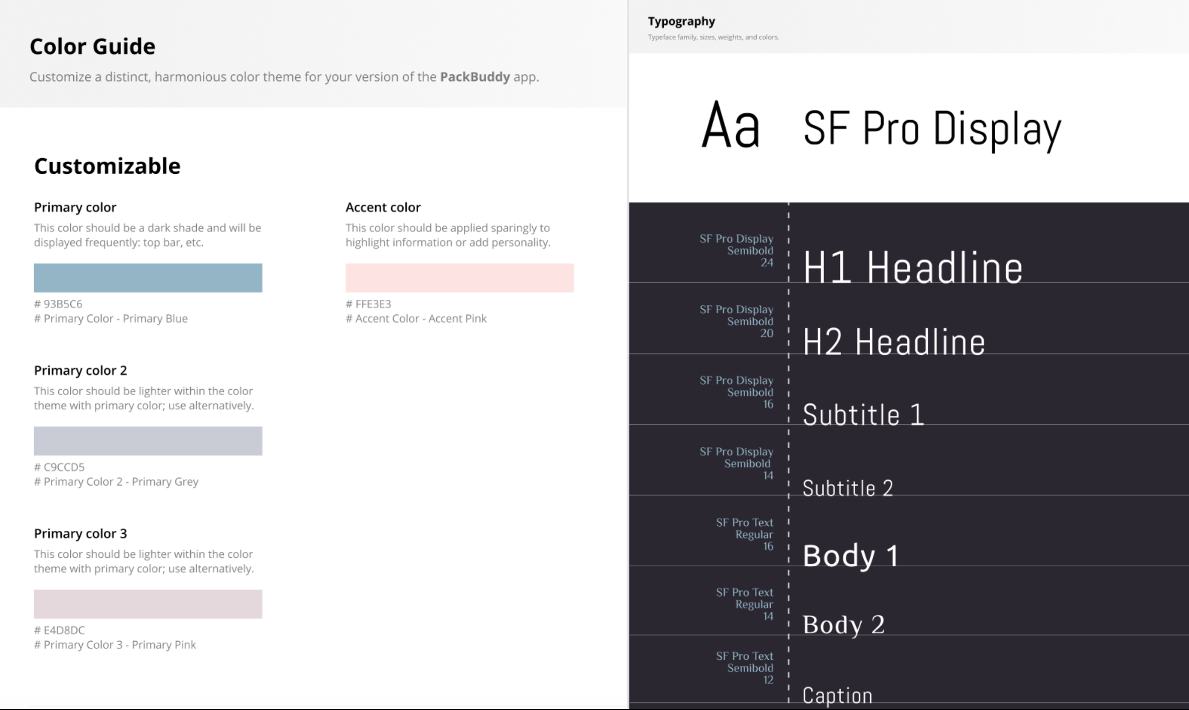
Style Guide
We wanted to incorporate the color blue to evoke feelings of calmness and trustworthiness in our app. Our final color scheme existed of muted blues, pinks, and greys to maintain a mature and modern feel. We stuck with the conventional typography from Apple for its familiarity and to standardize our application with other well known features and apps.Hi-Fi Screens
The team split up to begin working on the hi-fi screens for our application. Our visual designers worked in Figma to craft our screens, while our researchers conducted testing and refinement. As the team leader, I oversaw both teams and actively participated in tasks from both groups. We created 6 primary user flows - Scanning in a suitcase, viewing a suitcase, adding a trip, viewing your dashboard, adding a suitcase using our database, and adding an item to the suitcase.
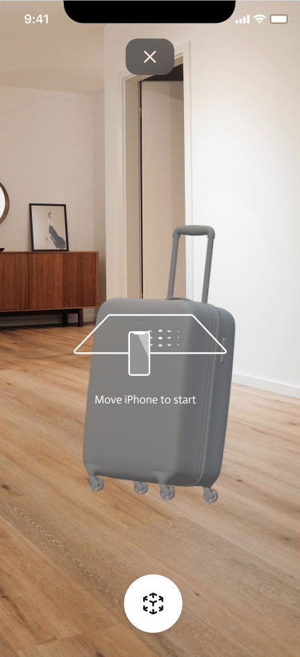
Scan Suitcase
Users can use augmented reality to scan their suitcase.
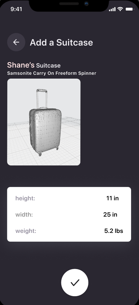
Suitcase Info
Suitcase brand and dimension are identified after scanning.
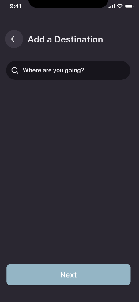
Add a Trip
Screen to input destination when adding a new trip.
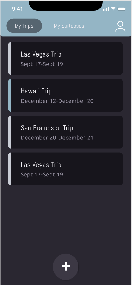
Dashboard
Users can create presets for multiple upcoming trips.
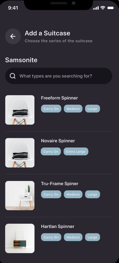
Add Suitcase
Users have the option to manually input their suitcase.
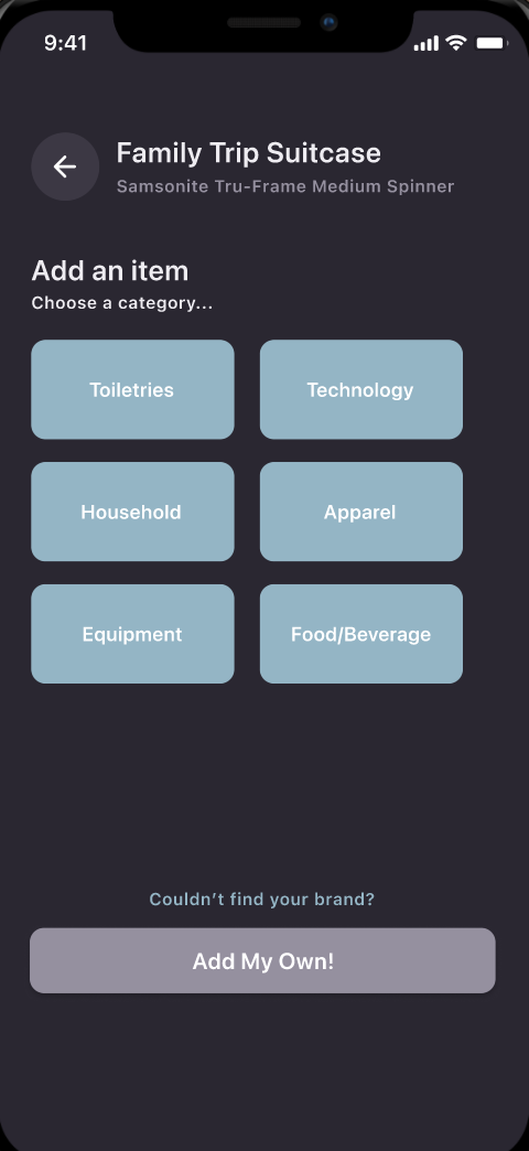
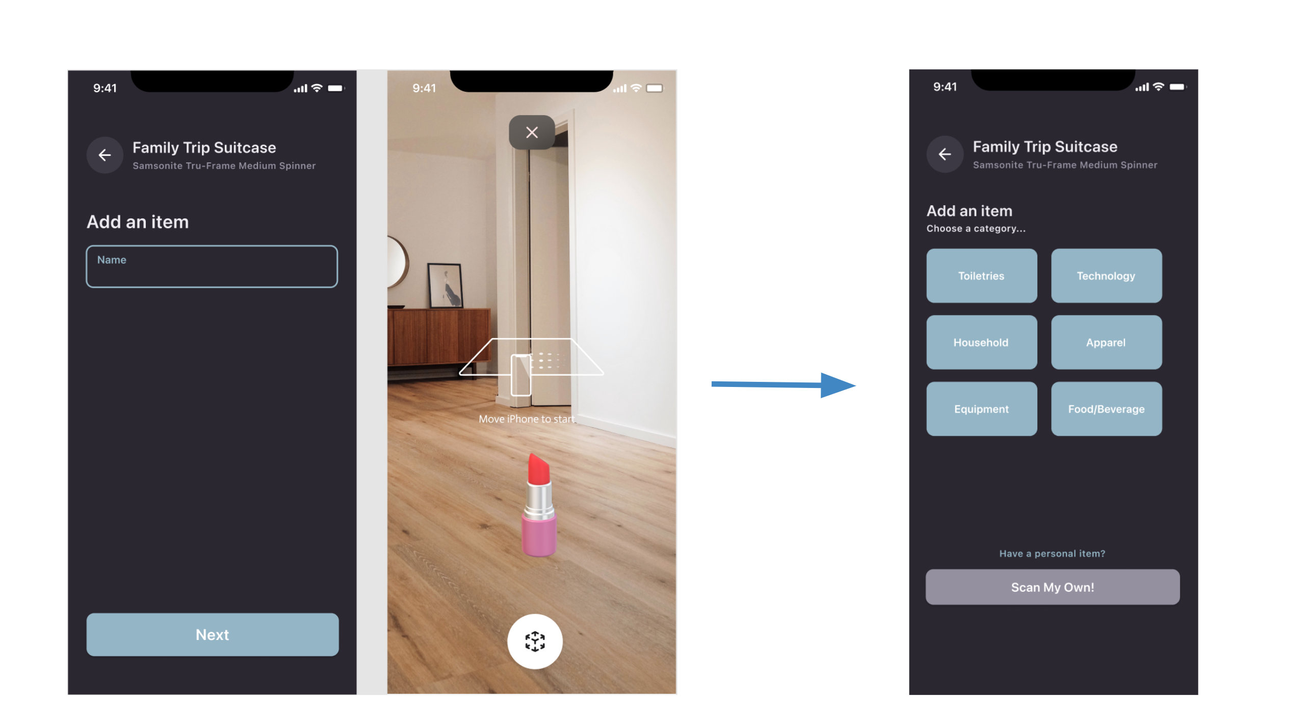
Add Item to Suitcase
Users can add and scan items into their suitcase after selecting a category or creating their own.
Testing and Refinement
Meanwhile, I led the team of researchers in drafting a Usability Test Plan. We
conducted our usability testing over Zoom, using the other teams in our class as a test group.
We walked them through each task and took notes as they offered us valuable feedback on our
prototype regarding its user flow, potential trouble spots, and general design suggestions
We received valuable feedback and suggestions for our application. For example, one user expressed concern with adding items into a suitcase. He mentioned to us that he owns a lot of shirts that are practically identical in dimension, and scanning each one into the suitcase would be extremely tedious. In response, we decided to add a feature that allows users to manually select generic items from a database that they want to add into their suitcase, while also giving them the option to scan in personal items if they wish. Another
user suggested that we offer a preset of suggested items that users can select all at once to save time. We ended
up incorporating both features in the following iterations.
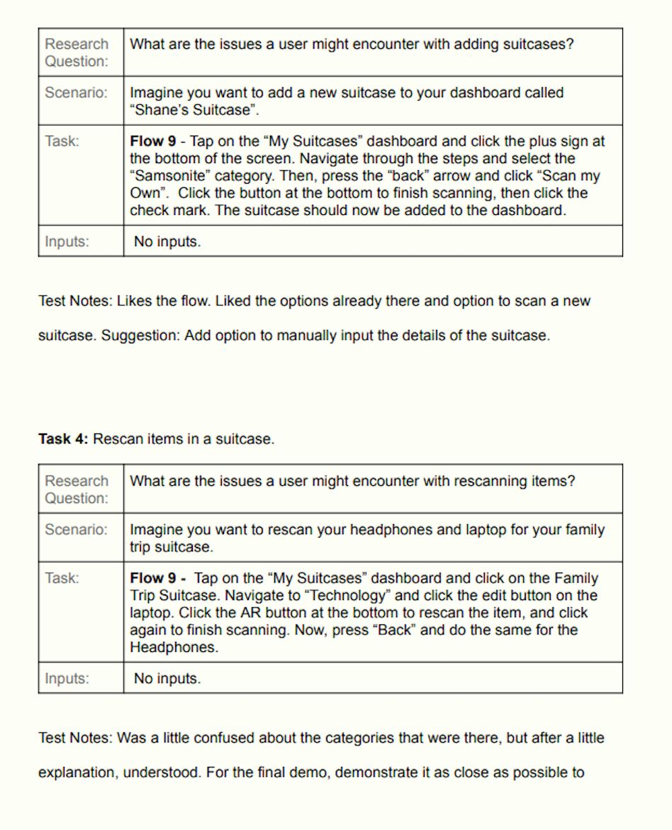
Usability Test Plan
We directed our users to perform a variety of tasks, such as scanning suitcase and subsequently scanning items to go inside the suitcase.
Demo
After multiple rounds of testing and refinement, we finally completed our prototype. We recorded a demo to showcase our application in action:
Final Thoughts
This project was my very first design project at UCSD. Reflecting on the process as a more experienced designer, there are a lot of things I wish I had done differently. For one, I find that this project failed to address a key element in the design process - research. In this project, we were asked to come up with a problem for a specific target group (travellers) and design a purely hypothetical solution for their needs. It was quite difficult to determine a specific need without conducting any research on our targeted user base. Ideally, I would have liked to deploy a questionnaire to frequent travellers with questions aimed at gathering insight into what stresses people out the most about travelling. If we had done so, I believe our solution would have more utility as it would allow us to make informed design decisions backed by real data about our users' needs and frustrations. Nevertheless, I think this project served as a good whirlwind introduction to the design world and helped me build familiarity in important UX processes such as creating User Personas and performing Competitive Analyses, as well as gave me valuable practice using interactive prototying software.